Leverage the power of rich media publishing the easy way!
version 3
First short video preview of K2 Next
02 July 2014
Published in
Blog
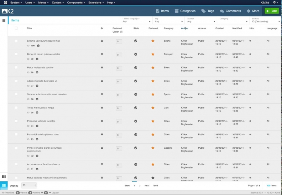
Here's a short demo video, showcasing the responsiveness of the new UI. Yeap, it feels like a desktop grade app. K2 Next is running on a remote (busy) dev server.
In this first video, I'm browsing and filtering a list of 100 K2 items, by using the top filters as well as the pagination buttons. Then I switch to "infinite scrolling" mode (no pagination, just a stream of all items).
Of course there are various things to "iron out" - design wise - and small bugs, but the functionality is ready!
More
